How to Know What Colors Actually Suit You
5 min read
Wdrobe
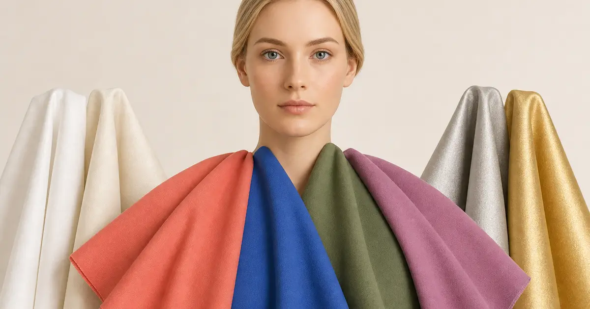
The most reliable way to learn which colors suit you is to compare them near
your face in consistent natural light. Look for clearer skin, balanced features,
and an overall sense that you appear before the color. You do not need to force
yourself into a seasonal category before you can make better choices.
Judging your own face is hard when you already know where to look for shadows and redness. One daylight photo is enough for the Wdrobe app's color analysis to suggest a palette: a short list to hold up at the window.
Set up a useful color test
Stand near a window in indirect daylight with minimal colored reflection from
walls. Wear a neutral top or cover it with a white, grey, or taupe cloth. Keep
the camera position and exposure the same if you take photos.
Compare real garments or fabric near your face. A small digital swatch on a
screen cannot show how the color interacts with your skin in that light.
Compare color dimensions one at a time
Warm versus cool
Compare similar depths, such as coral against cool pink, olive against
blue-green, or cream against optic white. Notice which side makes redness,
shadows, or sallowness more visible and which looks integrated.
Clear versus muted
Compare a vivid cobalt with a dusty blue, or bright red with muted burgundy.
Some complexions stay defined beside saturated color; others look more balanced
with softened shades.
Light versus deep
Compare pale blue with navy or blush with wine. The better depth often makes
your eyes and features appear more present without the garment looking heavy.
High versus low contrast
Try a black-and-white combination, then a softer navy-and-cream or
taupe-and-ivory combination. This can guide prints, layering, and accessories as
well as individual colors.
Undertone is almost impossible to judge from memory, and a shop mirror under warm lighting is not a fair test either. Hold the colours up to your own photo.
Judge the face, not the popularity of the color
Ask:
Do under-eye shadows look stronger or softer?
Does redness become the first thing you notice?
Do the eyes and mouth remain defined?
Does the color appear separate from you?
Would a different neckline or distance make it easier?
One difficult shade does not have to disappear from your wardrobe. Move it away
from the face through trousers, skirts, shoes, or bags. Add a flattering collar,
scarf, or jacket between the color and your skin.
Build a personal palette
Choose three reliable neutrals, four or five colors that work near your face,
and two accents you simply enjoy. Photograph the comparisons and note the
lighting. Your palette can include warm and cool shades; it does not need to
match a rigid label.
Remember that hair color, makeup, tan, lighting, and personal preference affect
the result. Color analysis is a tool for easier decisions, not a rule about
what you are allowed to wear.
Compare the colors with your wardrobe
Wdrobe can help you place a new color beside garments you own and save the most
useful combinations. Make the final judgment with the real fabric in natural
light.
Continue with a related guide
Knowing which shades suit you leaves one job left: turning them into a palette you can shop from.
Frequently asked questions
How do you know what colors suit you?
Hold the garment near your face in daylight and look at your skin rather than the clothing. Colors that suit you make your skin look even; colors that do not make you look tired or emphasize shadows.
Do I need a professional color analysis?
No. Seasonal color analysis can be a useful shorthand, but comparing two shades against your face in natural light answers the practical question faster and costs nothing.
Can you wear a color that does not suit you?
Yes, move it away from your face. A shade that drains you as a top works as trousers, a skirt or a bag, and a scarf in a flattering color solves it entirely.
Shades that flatter your face are only half the problem; whether they agree with each other is the other half, which a planned palette settles. If you have already asked a chatbot for your season, ChatGPT colour analysis covers how much weight that answer deserves.
Once you know your undertone, apply it to the neutrals you wear most: what colours go with navy blue clothes, what colours go with beige clothes and what colours go with charcoal grey clothes.
Working out your undertone is useful, but it only pays off when you apply it to the clothes you already own rather than the ones you might buy. Test the colours against your own face to sort your wardrobe by colour, see which pieces sit in your range, and shop against the gaps instead of guessing.
← All articles
Take Wdrobe with you
Enjoyed the read? Get the full virtual try-on experience — download Wdrobe on the App Store or Google Play.
Related articles

Ten outfits for kelly and true green clothes, a quick way to tell which green you own, and the shoes, metal and mistakes that decide whether bright green works.
Read Article
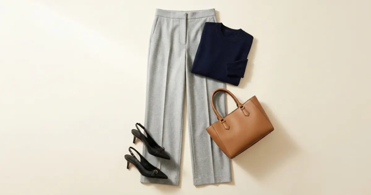
Eleven complete outfits for light and mid grey trousers, from the office to a summer holiday, and how the cut and the shoe change each one.
Read Article
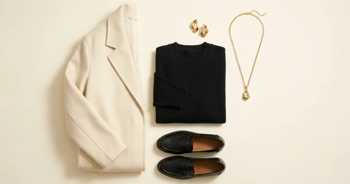
Gold behaves like a warm neutral with a light source in it. Here is what it sits beside, and the outfits that use it well.
Read Article